Visualization & Dashboard Guide
Learn how to transform query results into rich visualizations and assemble dashboards that keep your team aligned on performance, usage, and operational insights.
Overview
The Visualization screen lets you build charts from saved queries, configure chart types, labels, and color themes, and save visualizations to a shared library. The Dashboard screen lets you combine those visualizations into panels you can arrange, resize, and share for a consolidated view of your database activity.
Access the Visualization & Dashboard Screens
Both screens are available from the left navigation once you are signed in to your Onyx Cloud account.
Sign in to Onyx Cloud
Use your organization credentials to access the Onyx Cloud console.
Open Visualization or Dashboard
Select Visualization to build charts or Dashboard to assemble panels. Both views use the same saved queries and visualization library.
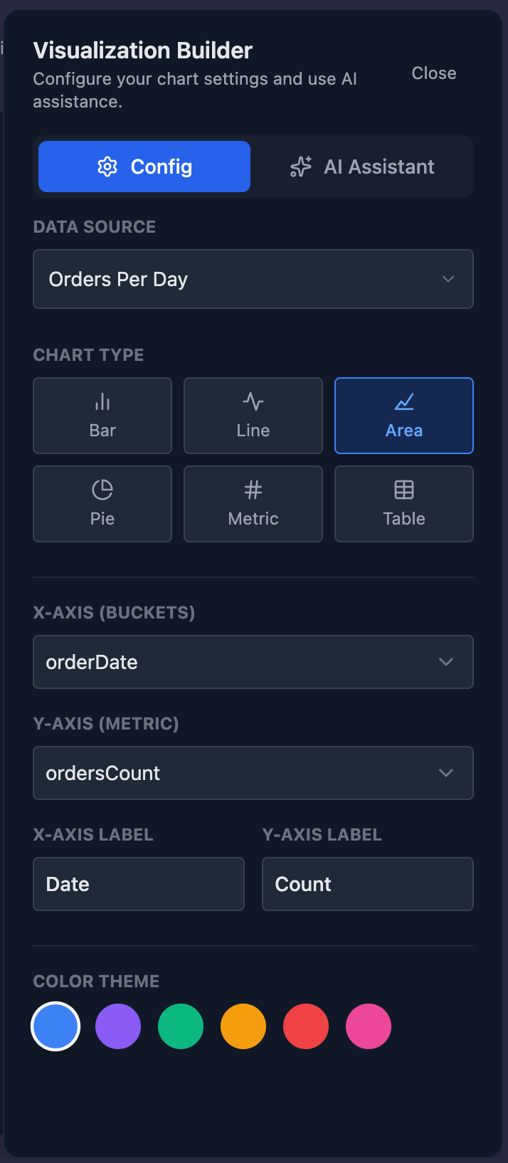
Visualization Workspace
The Visualization screen is split into a saved visualization library and a builder panel. The library lists saved charts with search, edit, delete, and public sharing controls. The builder panel lets you configure the data source, chart type, axes, labels, and color theme.
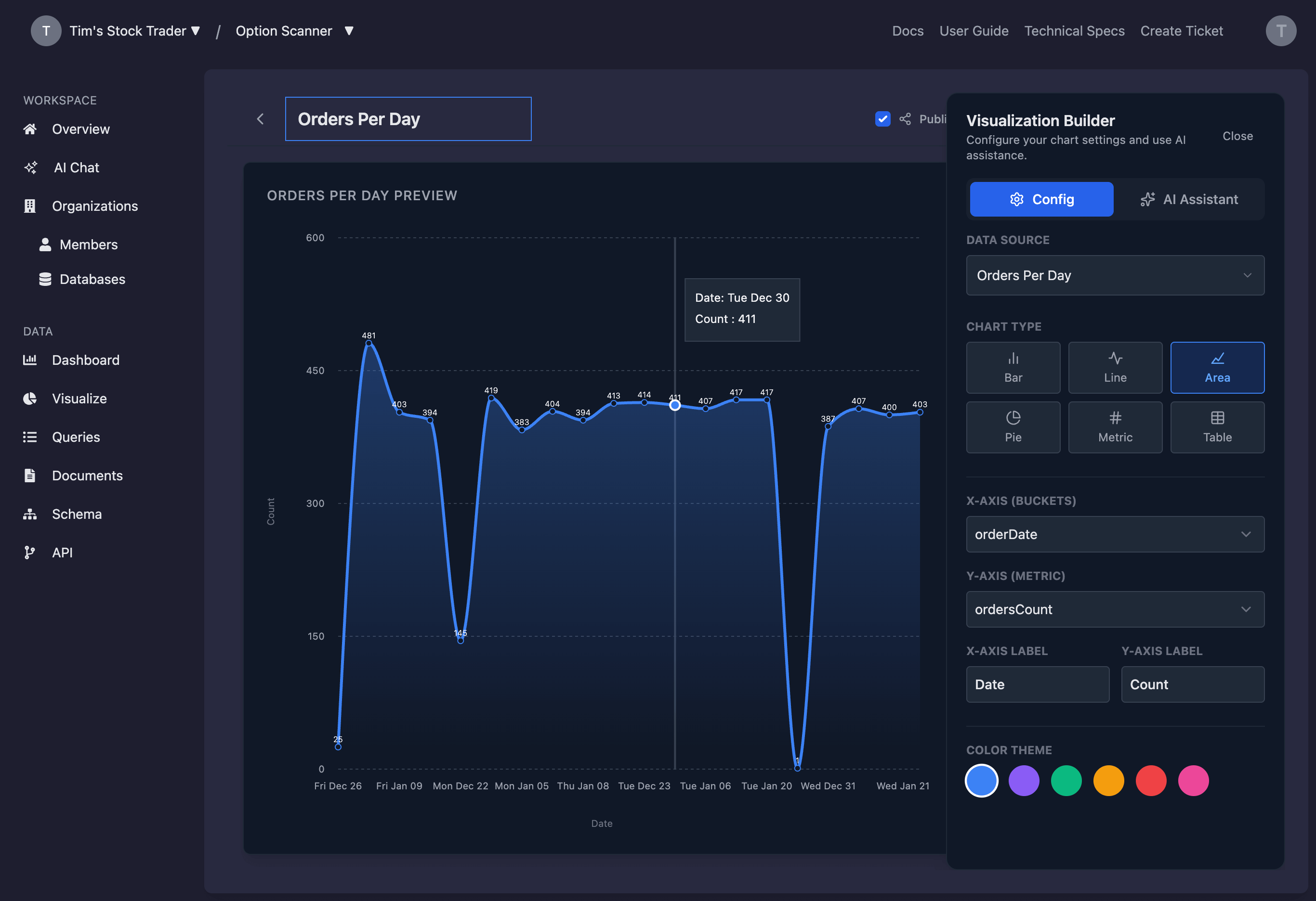
Build Visualizations
Visualizations are generated from saved queries in the Query Editor. Choose a data source, select a chart type, and map fields to axes or metrics. Use the live preview to confirm the chart responds to your configuration changes.
Select a data source
Pick a saved query from the data source dropdown. If a query is running, you can cancel execution from the builder panel.
Choose a chart type
Select from bar, line, area, pie, metric, or table views based on how you want to interpret the data.
Map fields and labels
Assign fields to the X and Y axes (or category and value fields for pie charts). Customize axis or metric labels to keep dashboards readable for stakeholders.
Adjust the chart theme
Pick a color swatch to align with your reporting standards and highlight key trends.
AI Visualization Assistant
Use the AI assistant to describe the chart you want to build in plain language. The assistant proposes chart settings that you can refine in the builder panel.
Open the AI Assistant tab
Switch to the AI Assistant in the builder panel to view suggested prompts or enter your own request.
Describe the visualization
Provide instructions such as “Line chart of CPU usage over time” or “Table of error logs grouped by service.”
Review the generated configuration
Apply the suggestion, then fine-tune fields, labels, or colors to match your reporting needs.
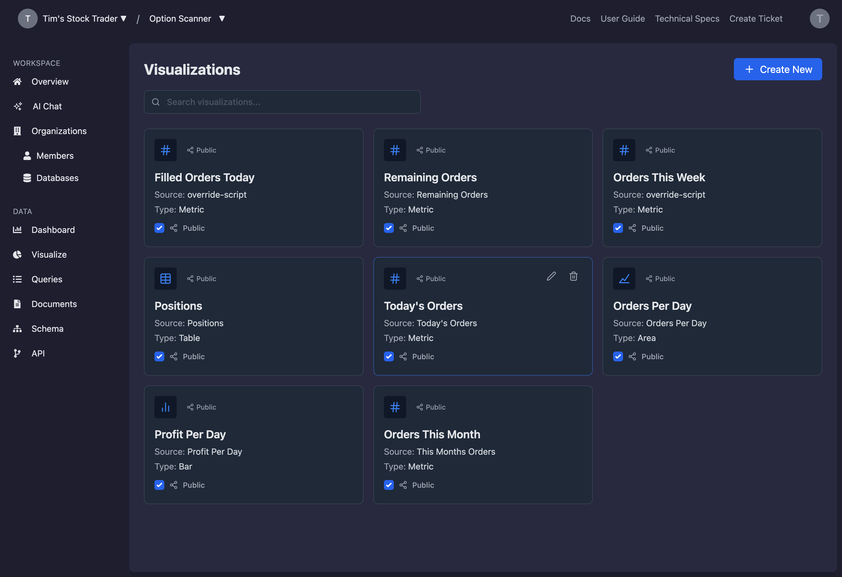
Manage Visualization Library
Saved visualizations appear in the library. Use the search bar to locate charts, edit to refine settings, or delete charts that are no longer relevant.
Create new visualizations
Select Create New to open a fresh builder session and add the chart to your library.
Edit or delete existing charts
Use the edit icon to update a chart or the trash icon to remove it. Deleting a visualization also removes it from any dashboards that reference it.
Toggle public visibility
Mark a visualization as public to make it eligible for sharing. Public status is visible in the library.
Dashboard Workspace
Dashboards collect multiple visualizations into a single view. You can create multiple dashboards, switch between them, and manage which panels appear on each one.
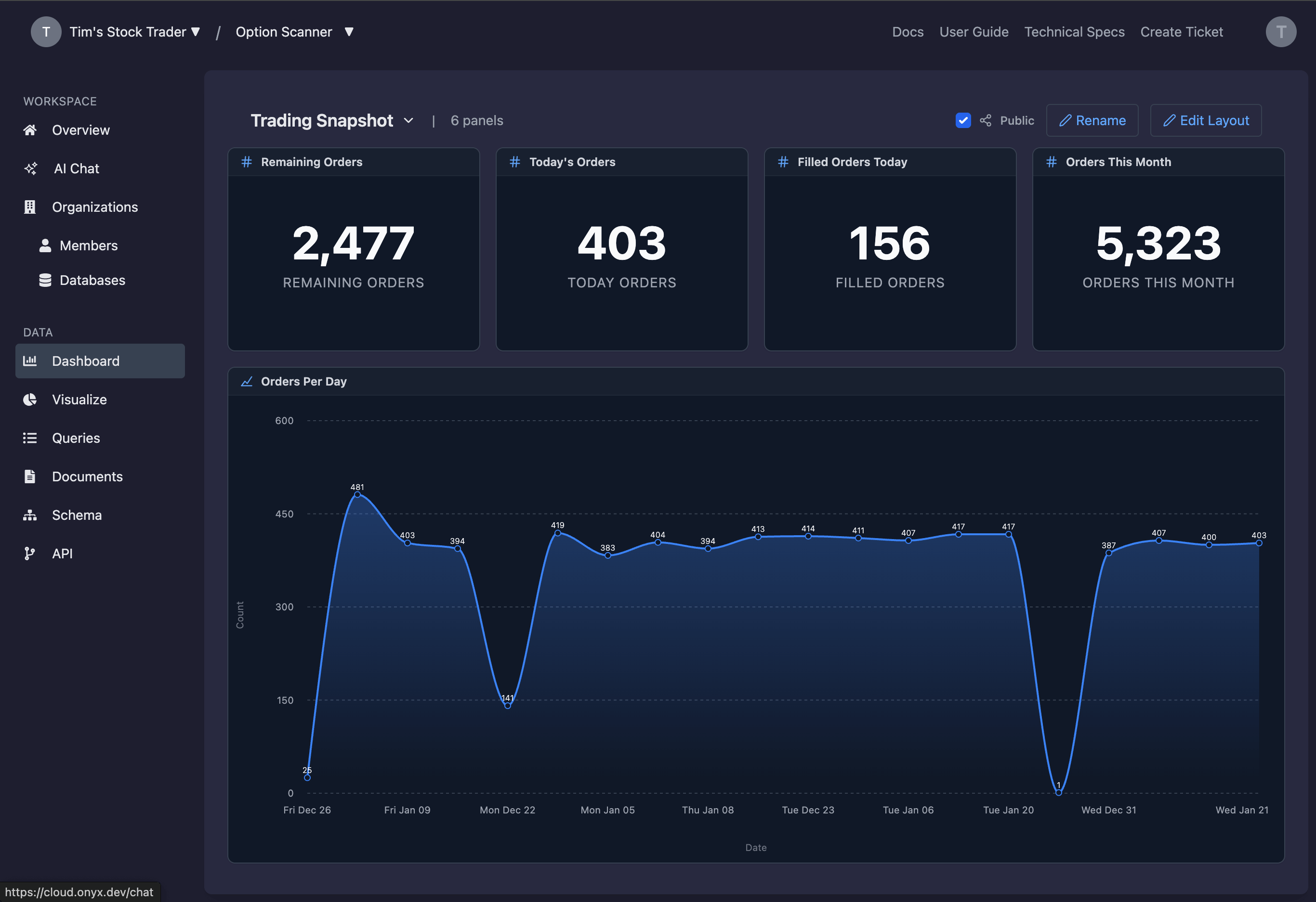
Assemble and Edit Dashboards
Add panels from your visualization library, arrange them on a grid, and resize them to create a layout that fits executive dashboards or operational reviews.
Create or switch dashboards
Use the dashboard dropdown to switch or create new dashboards without leaving the page.
Enter Edit Layout mode
Select Edit Layout to unlock drag handles, add panels, and remove widgets from the grid.
Add panels from saved visualizations
Choose Add Panel and pick from your saved visualizations. Each panel inherits the chart configuration from the library.
Drag, resize, and remove panels
Drag panels by their headers, resize with the corner handle, and remove any panel that is no longer needed.
Troubleshooting and Best Practices
If the visualization data looks empty, verify the underlying query runs successfully and returns fields that match the selected axes. For dashboards, ensure the visualization you want to add is saved in the library.
Keep dashboards focused by grouping related metrics together. Use multiple dashboards for separate audiences such as operations, analytics, and executive reporting.
Next Steps
Need Help?
If you have any questions or need assistance:
- Email:support@onyx.dev
- Documentation: Visit ourHelp Centerfor tutorials and FAQs.